The digital world has seen the evolution of many marketing strategies.
As we're adapting to more and more sophisticated techniques, the question becomes pertinent - is email marketing still relevant?
A simple answer will be yes!
Email marketing has several advantages that make it relevant. The most important point in its favor is that most of the people who use the internet relate to or use email. Thus, email serves as a cost-effective and instant method to reach a multitude. They are also measurable and can be targeted for a specific audience.
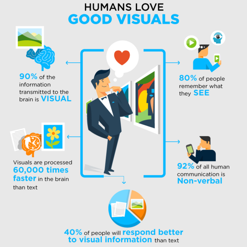
However, there is a small challenge – the email might not hit the intended mark. A reader might not have the time to read the email and throw them in the trash but the reader also might open the mail and find it boring and delete it. So, how can we make this marketing technique more effective? How UI Tested Visuals Can Improve Your Email Marketing One way to make the readers notice your emails is to include design elements that break the monotony of written words. The inclusion of visual elements in emails like photos, illustrations, or videos can be very effective in this situation. We're always attracted to things with a visual appeal. Anything colorful or aesthetically pleasing catches our eye and holds our attention. This aspect of visual design can be used effectively to improve communication through email marketing.
1. Benefits of visual elements

There are many benefits of adding visual elements in your email communication, some of which are highlighted below.
Holding the attention of the readers: The reader must be receiving quite several emails every day and might allot just a few seconds to open a mail and scan the content before deciding it. While just a copy might not engage the attention of the reader, a well-made visual element might do the trick and make the reader spend more time on the email to go through the content. It generates more click-throughs and may also generate an interest in the reader about the product.
Better information processing: Since strong visual elements can grab the readers' attention for a longer time, they also allow them to process the information for a longer period. As a result, the readers understand the message more clearly in a shorter period.
Making an emotional connect: It is easier for the reader to relate to an image than a written description on an emotional plane. This emotional connection is the most important step to create a long-term and meaningful association between the readers and a product.
Prompting a call to action: All the above points can trigger an interest in the product and the reader might be interested to know more. This might result in more inquiries and finally more conversions.
2. Types of visual communication
There are broadly three types of visual elements that can help to improve the effect of email communication.
Still images:
They are the most common form of a visual element. This can be a photograph or an illustration or an infographic. They are quite ideal in situations where you display your product or make an emotional appeal or highlight a point. Product images help readers to see the physical appearance.
An interesting image might elicit interest in the product or interesting typography can arrest your attention to a word central to the communication. They are easy to make, cost-effective, and can be uploaded or downloaded easily for their small size. This ease of handling makes them the most versatile and common tool to be used in visual communication in emails.
Moving images:
They are mostly in the form of short videos. The video format can vary and can consist of real or shot footage or animation. Moving images are effective in a situation where you have to describe a process or a service. They are also a great way to depict human emotions and inspire an emotional connection with the product or service. Animation can be used effectively to describe a hidden process or to present an amplified emotion. You also can animate animals, objects, or texts depending on your design requirements.
Videos are a great way to say a lot in a small time. There are a few disadvantages though. They have to be shot and edited before you upload and the whole process of producing a video can be costly. Moreover, video files can be large and can be slower to upload or download. The large size also faces restrictions from the bandwidth regarding resolution. they won’t be suitable for an area with internet connectivity issues.
GIFs:
Graphics Interchange Formats or GIFs as we know them are in video format but of a much shorter length. They can be used effectively to convey a short message like a specific emotion or aspect and often are humorous. They can inject humor and fun into your communication successfully. Texts and infographics can also be effectively converted to GIFs. They are a cost-effective solution and can be an alternative to videos if used interestingly. GIFs are smaller in size than normal videos and thus are easy to download and store. Like still images, they can also be sent and viewed in different formats.
3. Effective ways to use visual elements

You know the importance of visual elements in email marketing – but how do you achieve your goal? Here are some points to consider:
Develop your brand identity: You should ensure visual identity so that there is a synergy in the visual elements representing the brand/products across all channels. The logo that appears in your emails should not be different in the product video or image. These should include:
- Fonts
- Color palette.
- Logo
- USP/ features
- Image style
Be experimental: Think about the result you desire and feel free to experiment with fonts, colors, and image styles, and forms. The priority should be on creating visuals that will get your readers' attention and engage them. Be innovative with GIFs and infographics.
Don’t compromise on quality: A hazy photograph of your product or a blurred video of service won't serve your purpose. You need to identify the elements that need to be represented properly. This doesn't mean that you have to spend a lot on them. It is not difficult to click a clear product photograph.
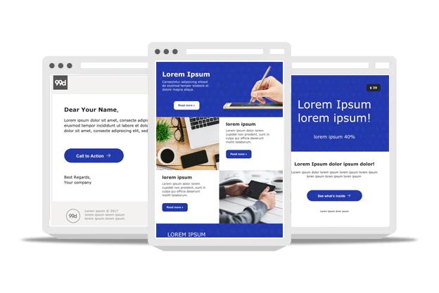
Make your call to actions (CTAs) interesting: Think beyond text-based Call to Action and add some image to it. This can provide your readers with a visual clue. A small animation or GIF leading the readers to the call-to-action button can prompt conversions.
Use emotions: Emotions can brighten a drab content and make a connection with your readers. Videos play a very important role in portraying emotion. You can even make a personal direct appeal to your readers or show the situation that prompted you to make that appeal. There is an increase in interest when readers see there is a video attached.
Be informative: Infographics and animation can be combined to create interest and provide: e.g. an animated chart can clearly show a progression. Decide what information needs greater elucidation and use charts, graphs, and other elements. The best way is to use infographics when you want to convey a difficult piece of information to the readers.
4. Visual / UI testing of visuals

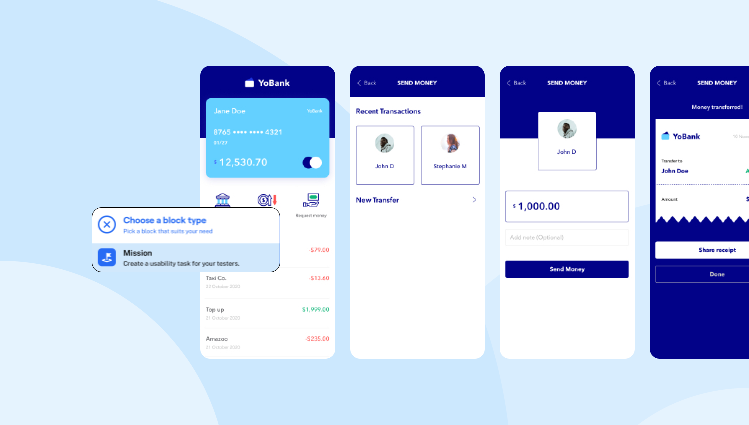
User Experience (UI) testing or visual testing is used in software development. In simple terms, UI testing ensures that the UI of the software/app appears correctly to the users. Essentially, UI tests check whether each element on a webpage is in the right shape, size, and position and are functioning according to the design. The principle is applied to test the visual elements of the product communication.
There is often confusion between UI and UX(user experience). Though UI and UX are part of visual designing, UX is the experience of the users when using the software/app and UI is the aspect of software /app they are interacting with while using.
In today's connected world we use multiple browsers, operating systems, and apps. When you are targeting a multitude at the same time you should be sure that your visual communication is reaching all or most of them. It would be very unfortunate if your carefully crafted visual communication would remain invisible to a large section of viewers simply because of an incompatibility issue.
Conclusion
UI or visual testing is done to seek and correct any visual errors that might have happened during the development process and to ensure that all the visual elements can be seen across browsers, operating systems, and media players and viewers.
Visual communication designing is an evolving and adaptive process, but the basics remain the same. As technology changes, you have to change how you apply the design principles to suit new requirements, but you need to be very sure of what you require and what objective you seek. These basic tips to use visual elements can help improve your email marketing and profits at large.

